Good morning, peeps!
It's time for me to do my online spring cleaning (we'll get to the house later, oh, and the deck-- ugh!). I am fixing my backgrounds to make them more readable. My husband, Bob, has been complaining about the distractions for a long time. Actually, since I first put them up! At first, I was oblivious to it, but it's actually starting to bother me now too. So, here goes.
Mainly, I'm trying to make just the scrolling part plainer, and get the annoying graphics from flopping all over the words-- like this overgrown rose! Over it goes!! It's some work, but not that bad, so I've just been lazy. It's time to do it.
If you have any suggestions, complaints, or reasonable advice, please post it in the comments, or mail me on Facebook or at painting4jesus@yahoo.com
Speak now or forever hold your peace! (Just kidding! You can tell me later, but I may not respond-- or you'll have to wait til next spring!)
Lots of love!
Karen
Update:
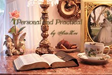
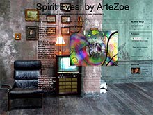
OK, this is a newer version, cleaned up. There is still a little bit of design behind the words. Am I paranoid of a blank space? Oh, maybe a little. Is it distracting to you when you try to read? I can't fix the header image to make it fit the border, even though it's supposed to auto fit. Any help? And the image I use for the background is the right size when I upload it to Flickr, but it seems to shrink when I put it here, and the edges are tiled a bit (you can only see this with a very large screen like mine 1900 X 1200 px. Don't know how to fix that either.
OOps! Silly me! My screen resolution is 1929 X 1200. That could be the problem! I told you I wasn't good at numbers ;)
Saturday, April 10, 2010
Fixing My Blog Backgrounds
Labels:
ArteZoe,
background,
blog,
change,
fix,
new and improved
Subscribe to:
Post Comments (Atom)












No comments:
Post a Comment